Website design for Retina displays

In most cases, Macs are equipped with a “Retina” display, or in other words, a high-resolution screen.
These displays have a much higher pixel density than the average user’s screen.
For example, a MacBook Pro can easily have a resolution of 2560 x 1600, which is much higher than the standard 1920 x 1080 (desktop format) or even 1336 x 768 (laptop format).

This is an important feature to bear in mind when designing layouts.
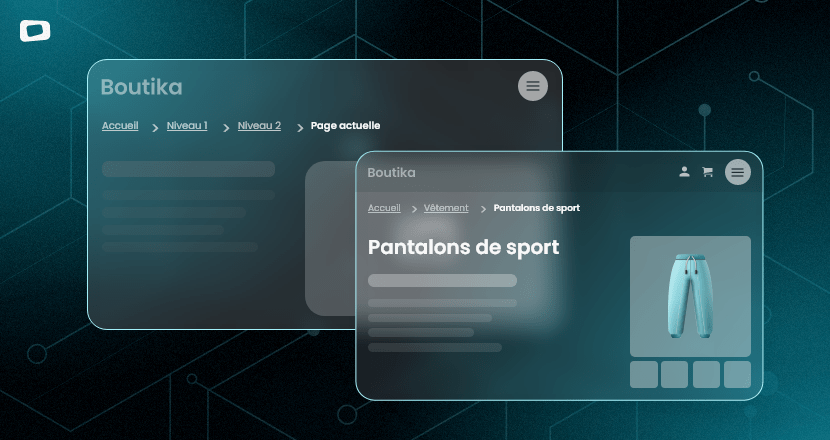
A 1920-pixel work surface will look very small on a 2560-pixel screen(about 2 times smaller).
A common mistake is to enlarge visual elements to compensate.
However, when a user opens the site on a standard 1920-pixel screen, everything will look too big(about 2 times bigger).
Obviously, the most effective method would be to validate your layouts on a 1920-pixel screen.
If this isn’t possible, we have a few tips for you.
Standard character sizes
Start by defining the sizes of your headings and paragraphs.
In general, headings(H1) are 48 – 64 pixels and H2s are 32 – 48 pixels.
Paragraphs are generally between 16 and 20 pixels.
If you start your layouts using these more common values, the other visual elements should follow suit and be proportional to these sizes to maintain a balance.

200% zoom
To get a better idea of the actual size of your project, “zoom in” on your work surface between 150 and 200%.
Note, however, that this will never be an exact representation.
You can combine this trick with the tip above.
Prioritize content flexibility
In addition to the above tips, it’s essential to design your layouts so that they can flexibly adapt to different screen resolutions.
This means considering how content will react when screen size changes.
Use fluid layouts and flexible containers so that content can stretch or shrink elegantly according to the user’s screen.
This approach guarantees an optimal user experience, whatever the screen resolution.

Conclusion
Taking screen resolution into account when designing layouts is a fundamental aspect of creating efficient and enjoyable user interfaces.
High-resolution screens, common on Macs with Retina displays, offer exceptional visual quality, but they require a thoughtful design approach to avoid user experience problems.
By following the tips presented, such as defining standard font sizes and using percentages for dimensions, you can create layouts that adapt harmoniously to a variety of screen resolutions.
What’s more, the trick of zooming to 200% can give you a better perspective of the project’s actual size.
Ultimately, the key to success lies in flexibility and foresight.
Adaptive design enables you to deliver a consistent user experience, regardless of the screens your visitors use, while ensuring that content remains readable and attractive.
By heeding these tips, you can create layouts that stand up to the challenge of varying screen resolutions and deliver an outstanding user experience for all.
OTHER TIPS
The quality of our work and the meticulous management of our projects are our top priorities.
This has earned us a solid reputation with numerous companies, organizations and communications agencies in the region and internationally.