Best practices for designing a breadcrumb trail

Ariadne’s thread
In web design, there’s a navigational element known as a breadcrumb.
Its function is to help users find their way around the hierarchical structure of a website by indicating the page’s current location.
The analogy here comes from the Greek myth of Ariadne, who provided Theseus with a thread to help him avoid getting lost in the labyrinth.
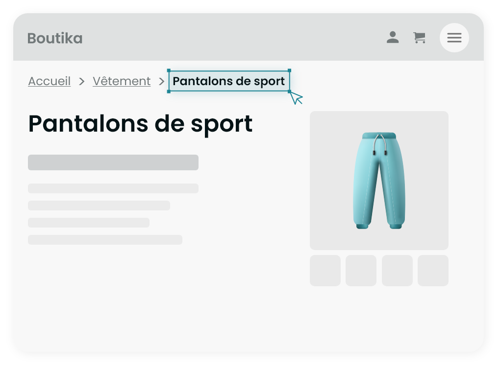
On a Web page, Ariadne’s thread is usually displayed at the top of the page in the form of a series of text links representing the path taken to access the current page.
For example, on an e-commerce site, it might look like this: Home > Product category > Product sub-category > Product name These links enable users to easily return to higher levels of the website structure with a single click.
This makes it easier to understand the current location on the site, explore other related sections and navigate more efficiently.

Start the breadcrumb trail with the home page
The breadcrumb trail starts from the home page, unless it’s already included in the navigation menu.
Include one or the other, but never both, to avoid unnecessary complexity.
Duplicate links can make site navigation less clear.
The aim of web design is to provide a clear structure and hierarchy to help users find the information they need quickly.
Duplicate links can blur and complicate this structure.

INCLUDE Current page
Be sure to integrate the current page as the last element of the breadcrumb trail, while distinguishing it visually and making it non-clickable.
By including the current page, you provide users with a clear indication of where they are currently on the site.
This reduces confusion and helps them find their way around.
Breadcrumbs play a vital role in SEO (search engine optimization).
When search engines crawl a website, they also use breadcrumb links to understand the site’s structure and index pages.
Including the current page in the breadcrumb trail can help search engines better understand the relationship between pages and improve visibility in search results.

Simple hierarchies don’t ALWAYS need a breadcrumb trail
If your website has only a few levels of pages and navigation is very linear and intuitive, a breadcrumb trail may seem superfluous.
In this case, it may be clear enough for users to know where they are without the need for a breadcrumb trail.
However, even if the hierarchy is simple in terms of depth, it can still be complex due to the multiplicity of page access paths.
For example, an e-commerce website with advanced search filters might benefit from a breadcrumb trail to help users follow the path they took to get to a particular page.
Ultimately, the decision to include a breadcrumb trail on a simple website depends on an analysis of your users’ needs and the clarity of your site’s structure.
If you think it can help your visitors find their way around your site, even in a simple hierarchical context, then adding a breadcrumb trail may be beneficial.

Simplify your breadcrumb trail for mobile devices
For mobile devices, it’s best not to overload the breadcrumb trail with all the available links.
Prioritize clarity, simplicity and user-friendliness to ensure an optimal user experience.
You could, for example, display only the last parent for better legibility and considerable space savings.

Conclusion
A well-designed breadcrumb trail improves navigation on your website, reduces bounce rates and makes it easier for visitors to find what they’re looking for.
By following these best practices, you can create an effective breadcrumb trail that enhances your users’ experience and reinforces your website’s structure.
OTHER TIPS
The quality of our work and the meticulous management of our projects are our top priorities.
This has earned us a solid reputation with numerous companies, organizations and communications agencies in the region and internationally.

